massielcheco.github.io
Project maintained by massielcheco Hosted on GitHub Pages — Theme by mattgraham
J24:
Final Feature Project Video
J23:
About Me

My name is Massiel Checo and I am a Sophomore student at Lehigh University double majoring in Journalism and Sociology with a minor in Marketing. I am from the Bronx, NY and I am bilingual. Here is my LinkedIn Page
This is a comic strip I made introducing myself using Pixton!

Is Lehigh University Diverse?
This is an infographic about Lehigh enrollment I created using Canva. I decided to focus not only race and ethnicity but also the places where Lehigh students come from because I believe diversity includes where a person physically lives as well. What suprised me the most was how many students from New York and New Jersey attend Lehigh. I expected most Lehigh students to come from Pennsylvania since Lehigh is a Pennsylvania university. The data proved me wrong!
.png)
Which of the Lehigh University colleges are most popular?
This is an infographic about the popularity between Lehigh’s colleges I created using Canva. This was interesting to create this infographic because often there is a big divide between the 3 colleges and a lot of talk about which college is more important and makes Lehigh most known. It felt really good to see that my college, the College of Arts and Sciences, was the most enrolled despite being known as the lower college.

The Evolution of Black Hair
This is a timeline I created about the evolution of black hair over the course of decades using Timeline JS. This was my favorite project because if you know me, you know that my hair is so important to me. Being a hispanic young lady with crazy curly hair, I try my best to keep my hair as intact and perfect as possible through a variety of methods and products, so researching and finding out about the evolution of my ancestor’s hair and how they maintained theirs was so amazing to me.
Lehigh University Fall 2016 Undergraduate Enrollment
This is a chart I created on Lehigh’s Fall 2016 undergraduate enrollment using Chartbuilder. I am biased towards Lehigh’s Fall 2016 data because that is when I started attending Lehigh. This was interesting because unlike the infographic I made regarding Lehigh’s colleges, the bar graph let me see the data in a more numerical form that made more sense.

Undergraduate Enrollment by college at Lehigh University over the course of 10 years
This is a chart I created on undergrad enrollment at Lehigh from 2007-2017 using Chartbuilder. This project was pretty cool to do because I had to analyze Lehigh data over the course of 10 years instead of one semester. I personally love seeing changes over time, so I really enjoyed making this!

Race/Ethnicity of Undergraduate Lehigh Students over the course of 10 years
This is a line chart I created on the race and ethnicity of undergraduate Lehigh students from 2007-2017 using Chartbuilder. This was my second favorite project of the semester. If you haven’t noticed, diversity is very important to me. Living in the Bronx, NY, I grew up seeing different people of all races everyday. Coming to a place like Lehigh, which is mostly dominated by white people, was very strange for me because I wasn’t used to being around people who weren’t like me. I really wanted to dedicate this project to the slow increase in diversity that Lehigh has had in the last 10 years. Although there could be higher percengtages of people of color here at Lehigh, this project made me proud of Lehigh in their efforts to make campus more diverse.

Popular Places to get Coffee near Lehigh University
Below is a map of some of the most popular places where Lehigh students like to buy coffee. I liked this project because I am a regular user of google maps and I always wondered how hard it must be for people to pinpoint every place of the earth. I decided to use coffee places because I love coffee and Bethlehem has a great selection of coffeehouses. It was interesting to use coding to create a map.
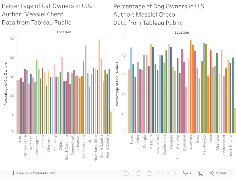
Cat vs Dog Owner Percentages in the U.S.
This is a infographic I created using Tableau about cat versus dog owner percentages in the United States. I chose this topic because I love dogs and I dislike cats, so I wanted to see if the majority of people agreed with me!
Unemployed people by marital status, race, Hispanic or Latino ethnicity, age, and sex 2016-2017
These are bar charts I created on unemployed people by a variety of factors including marital status, race, age, sex, etc. from 2016 and 2017 using Tableau. This was very interesting (and complicated) to create because I have witness so many people I know and love become unemployed, including my mother for a period of time. I decided to research and use this data to see if anyone else was going through the struggle my family went through, and unfortunately according to the data, thousands of other people did. Hopefully in the future unemployment rates among people of color can reduce.

